A great deal of online commerce, speech, and socializing supposedly happens over encrypted protocols. When using these protocols, users supposedly know what remote web site they are communicating with, and they know that nobody else can listen in. In the past, this blog has detailed how the technical protocols and legal framework are lacking. Today I’d like to talk about how secure communications are represented in the browser user interface (UI), and what users should be expected to believe based on those indicators.
The most ubiquitous indicator of a “secure” connection on the web is the “padlock icon.” For years, banks, commerce sites, and geek grandchildren have been telling people to “look for the lock.” However, The padlock has problems. First, it has been shown in user studies that despite all of the imploring, many people just don’t pay attention. Second, when they do pay attention, the padlock often gives them the impression that the site they are connecting to is the real-world person or company that the site claims to be (in reality, it usually just means that the connection is encrypted to “somebody”). Even more generally, many people think that the padlock means that they are “safe” to do whatever they wish on the site without risk. Finally, there are some tricky hacker moves that can make it appear that a padlock is present when it actually is not.
A few years ago, a group of engineers invented “Extended Validation” (EV) certificates. As opposed to “Domain Validation” (DV) certs that simply verify that you are talking to “somebody” who owns the domain, EV certificates actually do verify real-world identities. They also typically cause some prominent part of the browser to turn green and show the real-world entity’s name and location (eg: “Bank of America Corporation (US)”). Separately, the W3 Consortium recently issued a final draft of a document entitled “Web Security Context: User Interface Guidelines.” The document describes web site “identity signals,” saying that the browser must “make information about the identity of the Web site that a user interacts with available.” These developments highlight a shift in browser security UI from simply showing a binary padlock/no-padlock icon to showing more rich information about identity (when it exists).
In the course of trying to understand all of these changes, I made a disturbing discovery: different browser vendors are changing their security UI’s in different ways. Here are snapshots from some of the major browsers:
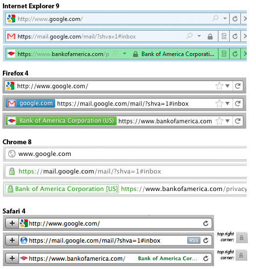
As you can see, all of the browsers other than Firefox still have a padlock icon (albeit in different places). Chrome now makes “https” and the padlock icon green regardless of whether it is DV or EV (see the debate here), whereas the other browsers reserve the green color for EV only. The confusion is made worse by the fact that Chrome appears to contain a bug in which the organization name/location (the only indication of EV validation) sometimes does not appear. Firefox chose to use the color blue for DV even though one of their user experience guys noted, “The color blue unfortunately carries no meaning or really any form of positive/negative connotation (this was intentional and the rational[e] is rather complex)”. The name/location from EV certificates appear in different places, and the method of coloring elements also varies (Safari in particular colors only the text, and does so in dark shades that can sometimes be hard to discern from black). Some browsers also make (different) portions of the url a shade of gray in an attempt to emphasize the domain you are visiting.
Almost all of the browsers have made changes to these elements in recent versions. Mozilla has been particularly aggressively changing Firefox’s user interface, with the most dramatic change being the removal of the padlock icon entirely as of Firefox 4. Here is the progression in changes to the UI when visiting DV-certified sites:
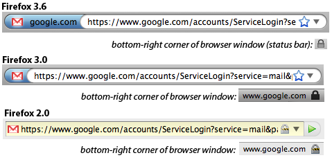
By stepping back to Firefox 2.0, we can see a much more prominent padlock icon in both the URL bar and in the bottom-right “status bar” along with an indication of what domain is being validated. Firefox 3.0 toned down the color scheme of the lock icon, making it less attention grabbing and removing it from the URL bar. It also removed the yellow background that the URL bar would show for encrypted sites, and introduced a blue glow around the site icon (“favicon”) if the site provided a DV cert. This area was named the “site identification button,” and is either grey, blue, or green depending on the level of security offered. Users can click on the button to get more information about the certificate, presuming they know to do so. At some point between Firefox 3.0 and 3.6, the domain name was moved from the status bar (and away from the padlock icon) to the “site identification button”.
In the soon-to-be-released Firefox 4 is the padlock icon removed altogether. Mozilla actually removed the “status bar” at the bottom of the screen completely, and the padlock icon with it. This has caused consternation among some users, and generated about 35k downloads of an addon that restores some of the functionality of the status bar (but not the padlock).
Are these changes a good thing? On the one hand, movement toward a more accurately descriptive system is generally laudable. On the other, I’m not sure whether there has been any study about how users interpret the color-only system — especially in the context of varying browser implementations. Anecdotally, I was unaware of the Firefox changes, and I had a moment of panic when I had just finished a banking transaction using a Firefox 4 beta and realized that there was no lock icon. I am not the only one. Perhaps I’m an outlier, and perhaps it’s worth the confusion in order to move to a better system. However, at the very least I would expect Mozilla to do more to proactively inform users about the changes.
It seems disturbing that the browsers are diverging in their visual language of security. I have heard people argue that competition in security UI could be a good thing, but I am not convinced that any benefits would outweigh the cost of confusing users. I’m also not sure that users are aware enough of the differences that they will consider it when selecting a browser… limiting the positive effects of any competition. What’s more, the problem is only set to get worse as more and more browsing takes place on mobile devices that are inherently constrained in what they can cram on the screen. Just take a look at iOS vs. Android:
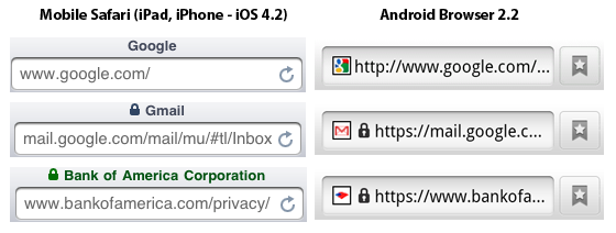
To begin with, Mobile Safari behaves differently from desktop Safari. The green color is even harder to see here, and one wonders whether the eye will notice any of these changes when they appear in the browser title bar (this is particularly evident when browsing on an iPad). Android’s browser displays a lock icon that is identical for DV and EV sites. Windows Phone 7 behaves similarly, but only when the URL bar is present — and the URL bar is automatically hidden when you rotate your phone into landscape mode. Blackberry shows a padlock icon inconspicuously in the top status bar of the phone (the same area as your signal strength and battery status). Blackberry uniquely shows an unlocked padlock icon when on non-encrypted sites, something I don’t remember in desktop browsers since Netscape Navigator (although maybe it’s a good idea to re-introduce some positive indication of “not encrypted”).
Some of my more cynical realistic colleagues have said that given the research showing that most users don’t pay attention to this stuff anyway, trying to fix it is pointless. I am sympathetic to that view, and I think that making more sites default to HTTPS, encouraging adoption of standards like HSTS, and working on standards to make it easier to encrypt web communications are probably lower hanging fruit. There nevertheless seems to be an opportunity here for some standardization amongst the browser vendors, with a foundation in actual usability testing.
The main concern is e-banking and e-commerce, right? Where there’s actual money directly at stake.
There, I think the real security flaw, the “original sin”, is in relying on shared secret numbers, such as credit card numbers and PINs.
If we truly want security, we need two things.
1. Someone — a bank, I expect — must sit between users and vendors in e-transactions for goods.
2. The user must be able to securely authenticate to the bank, and in a manner immune to MitM attacks.
Item 1 means the means of payment at online stores must change to allow some form of direct bank transfer of funds. A transaction: URL type could be created, which works with the solution to item 2 and commerce sites generate for purchases (or for paying users, e.g. for hosting ads).
Item 2 requires two things.
One, bypassing SSL and even the web browser as a whole for customer-bank interaction. The browser is just too insecure. I envision users going to a bank’s site and getting a disc that they freshly burned with a banking client program on it including one of a unique key-pair generated for the occasion. User goes home and installs it, then returns the disc in person to their bank branch; they destroy the disc and activate the ebanking account. (This procedure avoids the discs being stolen or dumpster-dived; getting those discs would be like ATM card cloning.)
Second, the host computer is still insecure; trojans and viruses abound. So a key step in the transaction’s authentication has to happen on trusted hardware. When the customer returns the disc the bank gives him a small, pocket calculator like device (it can even be solar, or dual battery/solar, powered) that performs a hash encryption. Every transaction using the installed software on their computer (including when it handles a transaction:// URL) involves at some point seeing a captcha-like group of digits to enter into the hand-held gadget and transform and punch back in. This is also used for swipe card transactions in stores. It replaces the memorized PIN and is not susceptible to replay attacks, unlike a PIN. Even a trojan on the user’s computer, sniffing everything the user did, can’t easily calculate what the correct numbers would be to fake a different transaction authentication, nor will replaying a sniffed transaction verbatim successfully replay it as transactions would have serial numbers and be idempotent.
Of course, besides adding more security, the encryption between user and bank, and between user and commerce site, will serve to try to protect privacy. Sniffed traffic would otherwise make it easy to learn a lot about a user and how wealthy they are, perhaps even to target burglaries. This would remain a danger of getting trojaned.
I believe the above is feasible. Having to make a few in person transactions at a bank to establish an account is a burden people are willing to accept, and the little PIN-gadget’s use is similar enough to captchas that it’s also likely to be something people would accept. (The PIN-gadget would, at its core, be a small crypto chip hooked up to a flash memory and a keypad, with the crypto key in the memory; the bank would open it up, flash the memory, and close it when the customer was to receive it and could recycle one by simply reflashing the memory. They could be made as cheap as cheap calculators, which you can find in dollar stores, given that the flash memory needed is on the order of <1KB and the only unique step in making each one is the flashing of the key into that memory when the device is activated. Customers who lost one or lost their computer's installed software would need to redo the in-person parts of this at the bank. They'd receive a new key pair for e-banking and the old one would be deactivated.)
Steve, sorry it took so long for me to comment on this. I think the main problem is a failure of assumptions on behalf of developers, specifically pertaining to how they perceive user incentives and what they believe users will notice and/or care about.
The observation that different browsers are using different SSL indicators is not new at all. This has always been the case. Depending on browser and/or platform, the lock icon sometimes appeared in the URL bar, the bottom status bar, the top menu bar, etc. So yes, the drastic changes that you document are likely to dilute the recognition of SSL indicators, although they were hardly very well recognized before. In fact, the lack of one standardized icon and a public awareness campaign means that users will trust any icon that looks remotely authoritative (see, Moores, “Do consumers understand the role of privacy seals in e-commerce?”).
EV is no better. It relies on this premise of users looking at the URL bar, noticing a lack of EV indicator, and then realizing they’re at an in secure website and going elsewhere. For starters, we know that users simply do not look outside of the content window unless they’re explicitly told to (see, Whalen and Inkpen, “Gathering evidence: use of visual security cues in web browsers”). The success of EV is also predicated on every legitimate website buying into the system, which we know to be false. Finally, it also assumes that users can tell when they’re being tricked by fraudulent indicators, which we also know to be false (see, Jackson et al, “An evaluation of extended validation and picture-in-picture phishing attacks”).
There is also a much larger problem at play here, in that users generally trust branding indicators much more than security indicators (see, Fogg et al., “What makes Web sites credible?: a report on a large quantitative study”). Thus, even when explicitly told that “this is a fraudulent website,” many users will ignore that message and transmit sensitive information simply because the fraudulent website had the correct logos displayed, causing them to erroneously believe the warning was in error (see, Egelman et al., “You’ve been warned: an empirical study of the effectiveness of web browser phishing warnings”).
The other problem is, how much should users actually care? The incentives are all wrong. When an SSL warning is ignored or the lack of an SSL indicator goes unnoticed, what is the probability of something bad actually happening? It’s infinitely small. Even when a user becomes a victim, what is actually lost? Under US law, the victim is only liable for the first $50, and in practice nothing at all. This makes the expected value of the decisions to trust or distrust an SSL indicator essentially equally. Furthermore, when a risk is actually realized, there’s no cognitive association between the cost and the prior decision to enter information into an insecure website. Thus, there’s no learned behavior.
I would make the argument that Firefox is doing the right thing by removing the lock icon, but for the wrong reasons: it’s a futile battle to create new SSL indicators that are just as likely to go unnoticed as previous ones, instead we should focus on creating more effective negative indicators. That is, better warnings and better detection mechanisms for when there’s an elevated risk level.
I find it hard to disagree with most of what you say, especially given that it is backed with so much empirical research.
That being said, I worry that negative indicators can only go so far. For instance, it seems that negative indicators don’t help users know whether any given connection is encrypted (or bound to an identity)… which is perhaps the primary use case. All that negative indicators do are to notify users when, if an encrypted connection exists or is expected, there is something amiss. As an end user, how do I evaluate in the first instance whether or not my banking connection is secured or trustworthy?
My fundamental argument in this post was that browsers should coordinate on security indicators. I think that this applies to negative indicators as well. However, even within the domain of positive indicators, I think there is value in coordination. Such coordination can only lead to better user education and awareness, with the caveat that the population of users that actually notice them might be small. Perhaps empirically informed collaboration on ideas in this space could actually converge on some positive indicators that are more likely to be paid attention to (or perhaps I’m just naive).
I don’t mean to say that negative indicators are the only way, they’re not. I just think that the current approaches have been thoroughly shown to not work and therefore we need to start anew. Expecting users to enter sensitive information on a website iff they see some special indicator is an untenable solution.
The ideal way forward is simply preventing disaster without putting the burden on the user. For instance, hashing credentials with the domain name so that even if a user enters information into a fraudulent website, the credentials are of little use (such proposals already exist).
As I said, the other problem is incentives: why should the user care in most cases? Fraud losses are borne by merchants and banks, neither of which have made any real effort to promote technologies that mitigate fraud (I’m talking about actually lowering fraud rates, not security theater that merely makes people feel warm and fuzzy). Currently they write off fraud losses (or pass them on in the form of higher rates/fees) because they are the cost of doing business, and often adopting effective mitigations would cost more than what is actually being lost. Which begs the question, is there really a problem here? I mean, if the stakeholders have no incentive to solve the problem, why should browser vendors who have even less at stake?
I think you’re right that “The ideal way forward is simply preventing disaster without putting the burden on the user.” There are many things we can do in this space (I hadn’t heard about the domain hashing idea… I’d be interested to hear more). HSTS and the like seem to operate in a similar zone. I’m not sure we can entirely remove the burden from the user, though… and for that portion of the problem I remain hopeful that improved UI can help.
On the fraud/liability issue, it may well be true that the credit card liability deals with many of the transactional issues. However I suspect that there are classes of disclosure harms — financial, identity, personal — that are not mitigated by those protections. There are definitely things that people want/need to do online that either do not fall under those protections or are on their face not even monetary but nevertheless highly valued to be confidential. Perhaps, however, given that ordinary transactions are often protected via the credit card company, the system is “good enough” for most consumers and indeed not really a problem.
“users supposedly know what remote web site they are communicating with, and they know that nobody else can listen in.”
…”Supposedly” being the key word. This discussion is largely irrelevant because the SSL business is largely a money making scheme. The icon does not indicate that your site is secure; it prevents one type of security vulnerability. You could have a thousand others; the site could still be shipping out data clear text elsewhere; the servers could be compromised; your computer could be trojaned.
Today the SSL cert business and the complicity of the web browser companies are why we do not have HTTPS everywhere. If web browser companies started accepting self signed certs to be just as valid as non-encrypted http sites instead of displaying POISON DANGER ICON, then all web servers could easily install with https. SSL certs are only needed for authentication.
Remember kids,
LOCK != SECURE
GREEN != SECURE
> If web browser companies started accepting self signed certs to be just as valid as non-encrypted http sites instead of displaying POISON DANGER ICON
Just tell me how you are going to solve the issues described at https://bugzilla.mozilla.org/show_bug.cgi?id=327181#c14 .
We need something better than the current public CA system in both trustworthiness and ease of deployment. That isn’t it.
…latest version, still shows a padlock, e.g. on Google Mail – in the bottom right corner of the window.
You are probably still using Firefox 3.6 because 4 is still in beta.
I’m happy to stand up and be counted: I’ve argued for at least 5 years that the standards process has frozen out security in the secure browser world.
I don’t know if competition can get the secure UI business moving again, but I do know that standards-thunking and the browser wars froze it out. Since the arisal of phishing (1st seen in 2001, and profitable by 2003) we’ve got a “standard” on “Green” and no shift in security exposure whatsoever. It’s widely recognised that while EV’s Green might be a small step in the right direction, it’s missing the most important parts, and is unlikely to make any difference because of so many other factors. All it will do is keep things stable for another year for existing players.
Roll on competition. It worked for Skype, which has a completely different interface for its clients. Which hasn’t stopped it being the world’s leading crypto product for many years (and is now the world’s leading mobile telco by mobile minutes shipped).
What standards process are you talking about? Browsers seem to have been quite free to do different things, so I’m puzzled about what you’re referring to.
The problem in the case of Skype was to choose a single underlying encryption protocol, and then design a user interface that didn’t even have to represent anything about encryption/identity (or am I missing something?). The browser problem is entirely different: to represent an ever-changing encryption/identity state to the end user.
SeaMonkey originally inherited its SSL UI from the Mozilla Suite which used the old Netscape lock (red stripe = https page with http content, yellow glow = https page) in its Classic theme; the Modern theme switched to using a lock with coloured backgrounds (red = https page with http content; yellow = https page). SeaMonkey subsequently switched its default theme to use the same style of lock as the Modern theme, and also added the yellow background to the URL bar. Finally for EV support we added a green background to the lock with a label showing the owner and also a green icon in the URL bar with a tooltip revealing the owner.
Has anyone encountered the situation where a Web site uses a favicon (an icon that is usually displayed near the site URL) that resembles a padlock? One might question as to whether this might confuse inexperienced users…
This is a problem that was I believe originally pointed out by Ian Grigg (but I could be wrong). He demonstrates it in action on his SSL Considered Harmful page. Moxie Marlinspike also demos this technique in combination with other exploits in his sslstrip video. As for examples in the wild, StartSSL has a padlock favicon, although I don’t think it’s nefarious (in fact, the guy who runs StartSSL discusses the issue here). Separately from the favicon issue, sites like Bank of America and Comodo show lock icons in elements of their web sites even when they are being accessed over non-HTTPS connections.
Chrome is the only browser I’ve seen that takes a step in the right direction by placing the favicon up in the tab only and not in the URL bar. You can’t tell that based on my screenshots above because I don’t show the tab as well… but as you can see the favicon is not in the URL bar.
Sure! http://blog.johnath.com/ (He works on Firefox’s security.)
You can see them here:
http://people.mozilla.com/~mbrubeck/screenshot-ssl.png
That was the point of Firefox’s redesign. People were relying too much on the padlock, and it was not good. By removing it altogether, some people, like yourself, will notice its absence and will quickly discover the new UI. That new UI will now inform them much more than the padlock did. So, in short, you freaking out might sound bad in the short term, but it’s a very good thing in the long term.
This might be true, hence my note that “perhaps it’s worth the confusion in order to move to a better system.” However, I’m a very technically knowledgeable user compared to average… and I already had quite a bit of knowledge about how the SSL system in particular works. I don’t anticipate that the vast majority of users are in my shoes. Has there been any testing to see whether most people really will “discover the new UI”? The people in that thread I linked to didn’t understand it right away, requiring them to google the issue, post to a forum, have someone reply, and read the reply.
In any case, cross-browser coordination and education would go a long way to mitigating the risk of confusion.
Personally, I think Firefox 3.6+ has gotten this right. The DV and EV indicators are distinctive and prominent and present the validated information while avoiding the false blanket suggestion of security associated with the padlock. I would encourage other browsers to adopt the Firefox indicators as a basis for further improvement.
I think the only thing missing is to tell users to look for the new indicator, and not the padlock. I can imagine Firefox 4 showing a balloon with a brief explanation the first time the user visits a secure site, but I don’t know if that would fly; the trick is to get the user to eventually read the balloon at a convenient time without harassing them when they are in a hurry.
Hey Steve – good overview, but I think some of the foundational premises are incorrect. I replied in more detail to your thread in the newsgroup.
I’ll reply in the newsgroup. I am sympathetic to the arguments you make, but on balance do not find them persuasive.
For those of you following along, there has been some good discussion in that newsgroup thread, including a link to the CAB Forum mailing list where a similar discussion between CAs and browsers happened last month.
I don’t view it as disturbing at all to see this kind of innovation going on. I think it’s great to see browser vendors experimenting with new interfaces.
And if different browsers experiment with different approaches, I think that’s fine: we will learn about what works and what doesn’t, and over time, I expect that browsers will adopt techniques from their competitors that work well and de-adopt techniques that don’t work well.
You worry about confusing users, but I’m not that confused. I suspect many/most users use one browser for most purposes, and so those users will just have to get used to their own browser — they don’t need coordinated UIs that are identical across browsers.
Bottom line: I think this change is a good thing. We know that past UIs had serious problems. The worst thing that browser vendors could do is stick with the status quo, when we know it has serious problems. Let’s hope some of the new designs improve upon the state of the art.
P.S. Incidentally, I think your pictures make a good case for concern that a few of the browsers may be heading in a not-great direction (e.g., Safari, Android). Thanks for doing this research and writing up a nice blog post summarizing where the browsers are going.
On most topics I would agree with this argument that leaving it to competition is best. This would tend to lead toward better solutions because trying to pre-determine an outcome is a recipe for bad solutions.
However, competition works best in situations in which consumers are attentive to the differences and likely to switch to the better product. I highly doubt that SSL UI effectiveness is a significant component of most consumers’ decision about which browser to use. Instead, browsers seem to be making changes based primarily on aesthetics, ideology, or guesses about what users expect.
Instead, user experience folks need to represent the interests of users. The best way to do this is to do actual usability testing. It’s possible that this is already a focus for all of the browsers I talked about, but if it were you would expect a more uniform outcome. Done well, usability testing that incorporates new ideas for UI can effectively stand in for the positive effects of competition in the public marketplace. When browser vendors coordinate on their changes they also reduce the risk of consumer confusion.
I think that user confusion in light of different UIs is a serious concern. To begin with, even if people use only one browser, that browser has likely implemented significant changes between recent versions. But furthermore, an increasing percentage of the population regularly accesses the web on a mobile device, adding at least a second browser. Add to this the fact that many people use different work and home computers. We also want people to know what is going on when they occasionally use other computers. At some point, it’s clear that they are going to encounter the problems I described.
Users might not choose between browsers on this basis, but I expect that browser vendors will be keeping an eye on what their competitors are doing to see what works best. Some diversity in the market gives us a chance to gain experience with multiple designs and find out which works best. If one is clearly superior, I’d expect browsers to start adopting that one.
User studies and attention paid to user experience are indeed important. But I don’t think you can conclude that just because different browsers have ended up with different designs, therefore they haven’t done user studies. That inference doesn’t seem valid to me. There is a large design space and no one has been able to identify a single design that is clearly superior, despite significant attention paid to the issue.
On user confusion: I think your argument proves too much. The concern about confusing users on browser upgrades from version to version would imply that browsers should never change their security-related UI: a conclusion that feels absurd to me, given that the current UI isn’t working. I think that realistically, when a browser decides whether to change their security UI, they will weigh the potential risks of confusion to existing users vs the potential benefits. But confusion due to difference in how other browsers do it seems like a distinctly secondary issue.
We’re both talking about browser competition. The primary way that producers of goods are motivated by competition is to gain or retain customers (or charge more, which is irrelevant in this case). It sounds like we agree that this is less likely. You are arguing that there is some other factor — perhaps an abstract commitment to making a more secure product — that would motivate them to adopt other browsers’ more superior designs. Perhaps this would happen eventually, but the divergence I describe in the post indicates the opposite. If anything, many vendors seem to be driven more by their opinion of what makes for appealing aesthetics.
I’d love to hear more about the extensive user testing you describe. The only publicized user studies I’m aware of are those pointing out flaws with the current system. There has indeed been significant attention paid to the problems, but I haven’t seen much about proposed solutions.
The user confusion argument doesn’t conclude that changes should never be made, but that they should be made consistently across browsers to the extent possible, and that users should be educated. It is of course always a balance, as I noted in my post.
Don’t forget to take a look at Opera 11, which also made a big change to the address field:
http://www.youtube.com/watch?v=OKcVXbLaHN0
It looks like they’re using yellow as an indicator… as well as some other differences.